Not too far from our shop in beautiful Bath, is the slightly larger city of Bristol (note the sarcasm on the slightly), birthplace of Joseph Fry. You might recognise Fry’s name from Turkish Delight and chocolate creams still sold in shops today, but he was also the inventor of the first chocolate bar and founder of a Bristol-based type-foundry, adding to Britain’s role in the growing print industry in the 18th century.

Before the digital era, printed matter had to be typeset using wood and metal moveable type, which is still used by letterpress printers today. Fry would have been making metal type as this is smaller in size (often up to around 24pt) and used for printing items like newspapers. It was vital for businesses in the printing industry to have a steady supply of type available to them and so it made sense for fellow Bristolian William Pine, owner of the Bristol Gazette, to go into business with Fry and create Bristol Letter Foundry in 1764. There were then several iterations of Fry’s type foundry, moving location to London several years later, and eventually closing in the early 20th century.

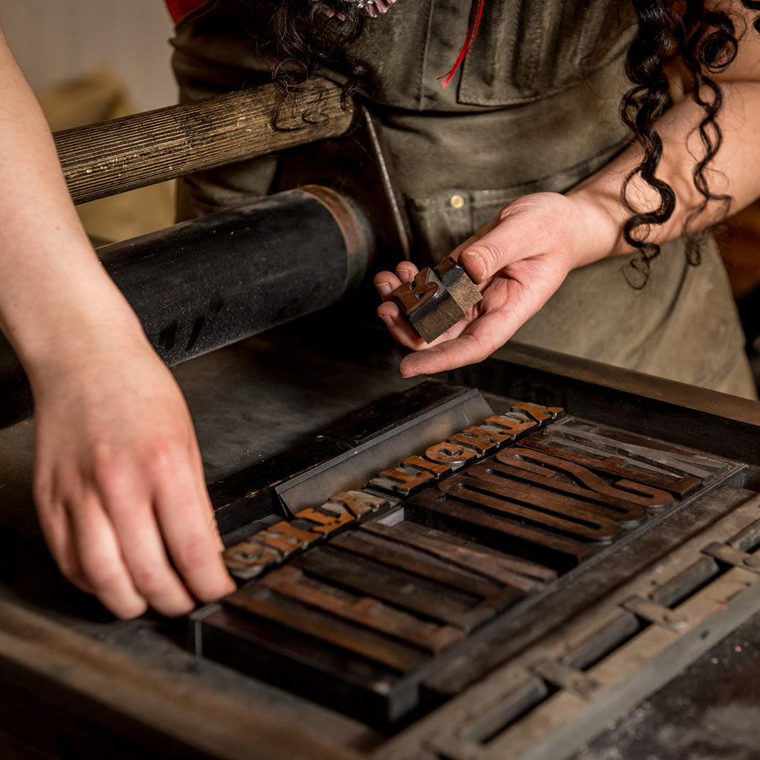
At first, Fry and Pine imitated the popular Baskerville typeface and then developed a type more similar to Caslon, which was considered more readable. An important factor if you’re selling newspapers. This functional use of a serif type contrasts to the decorative way in which one might use an italic or san serif type for advertising or on greetings cards, as we do here at Meticulous Ink. We also have several cases of wood and metal type in our workshop, which we use for letterpress printing small runs of posters on our flatbed presses. We even have a case of Caslon, showing the enduring timelessness of a successful typeface. As the demand for type has decreased and type foundries like Fry’s have closed, it has become harder to source, and wood type in particular has become an expensive commodity. We still love doing things the analog way, of course, and you can see a mixture of wood and metal type in our limited edition ‘Lefty Loosey, Righty Tighty’ art print, typeset by Athena, hand-inked. This was then printed on our Stephenson Blake proofing press, bringing things full circle, as Stephenson Blake also produced some of Fry’s very own typefaces!

If you’re looking for other letterpress printers in the South West, Nick Hand of The Letterpress Collective in Bristol, has a wonderful selection of type too, keeping the art of letterpress alive!
