So, much like us, you’ve fallen in love with Calligraphy, and you want to know more about its history and different styles!
In this blog post I’ll simply be covering the Latin alphabet, but Arabic and Chinese scripts have an extremely rich calligraphic history of their own, which is well worth further reading.
Calligraphy is all about the written word and how we communicate, this communication is done both in the meaning of the words and the style in which they are written. Different calligraphic styles speak to the formality of an occasion, how you are reading the text and what material the text is on. Just as you wouldn’t use comic sans on a wedding certificate, understanding the origins and uses of calligraphy can help us better understand its appropriate uses.
Imperial Capital
Our earliest form of the Roman alphabet is called Imperial Capital. Examples of Imperial Capital can be found carved in stone on monuments like Trajan’s column (113 CE), and is echoed in typefaces like Times New Roman.

This immense column, which can be seen in Rome or the V&A, honours the Emperor Trajan’s victory in battle.
The letters have a mixture of slim, straight lines, large, rounded o’s and serifs. Using a chisel and carving into stone, you can see why large straight letters were more practical to form, compared to small cursive ones, with the tools at their disposal both limiting, and adding to, the style. Legibility and simplicity was key, as these were public proclamations made to be seen by everyone in Rome. 2000 years later we can still read the text so they certainly achieved their aim. Overall the style is formal and can be read clearly and, as the ability to write and read the written word was held by the ruling classes, there are connotations of power and authority that come with this style as well.
Uncial
Uncial was developed by scribes when documents and holy texts were transcribed onto parchment to be preserved. Named after the Latin word for “inch”, the uncial style was made for smaller letters and longer texts.
As writing materials like vellum or parchment became widespread and a quill and ink were used to make marks, the uncial style developed out of practicality for faster writing.
The half-uncial style can be seen in The Book of Kells (c. 800 CE) which can be identified by bulbous letters and serifs. The scribes who copied manuscripts and religious texts played a vital role in holding knowledge and culture. There was an exclusivity in who could read these texts and which texts were copied down, as they were often held in monasteries and convents. The Book of Kells, which includes the four gospels of Matthew, Mark, Luke and John from the New Testament, is considered to be one of the finest examples of manuscript illumination and was largely written in Iron Gall Ink (which we still use at Meticulous Ink today!).

The Book of Kells can now be found at Trinity College Dublin, but don’t expect to be let loose to flick through its pages, due to its fragility only one page can be viewed at a time.
Carolingian Miniscule
The Emperor Charlemagne (747-814 AD) made a significant impact on writing styles, as he championed the production of manuscripts and knowledge throughout his empire. Encouraging a cohesive culture across Western Europe, Charlemagne supported the production of literature to solidify moral values. With more texts being produced, Carolingian miniscule was formed, uniting regional differences in letters and creating texts that were legible across the empire.

Versals
Scribes could really show off their calligraphic skills when it came to versals. These were more like illustrations than letters, and emphasised the first letter on the page. Versals were a way to decorate the text, built up of several lines and often brightly coloured with red, blue and gold.
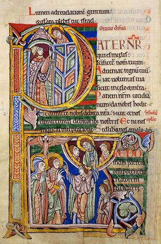
There are some fantastic examples found in medieval texts, the more elaborate the better, but this does mean they become almost illegible, a far cry from the formal, imperial capital style. The time and skill to create decorated letters and versals reveals a shift in the purpose of calligraphy, from being functional to being a show of craftsmanship and the reverence to religious texts like the Bible. You wouldn’t find a versal on your water bill, for instance.
Gothic
Gothic, or Black Letter, calligraphy moves us away from the rounded style of Carolingian back to an upright form. As a child, I can remember watching Disney Classics like Snow White, Sleeping Beauty, Cinderella, which introduce us to the story through the pages of a beautiful book, and now associate gothic calligraphy with fairy tales. The script can be identified by the contrasting strokes, created by a flat, broad nib at a 45 degree angle, rather than the less varied strokes of uncial.

The tight-knit nature of the gothic letters meant that scribes were saving space, and therefore, money, by using less vellum, but they also created a beautiful, new calligraphic style.
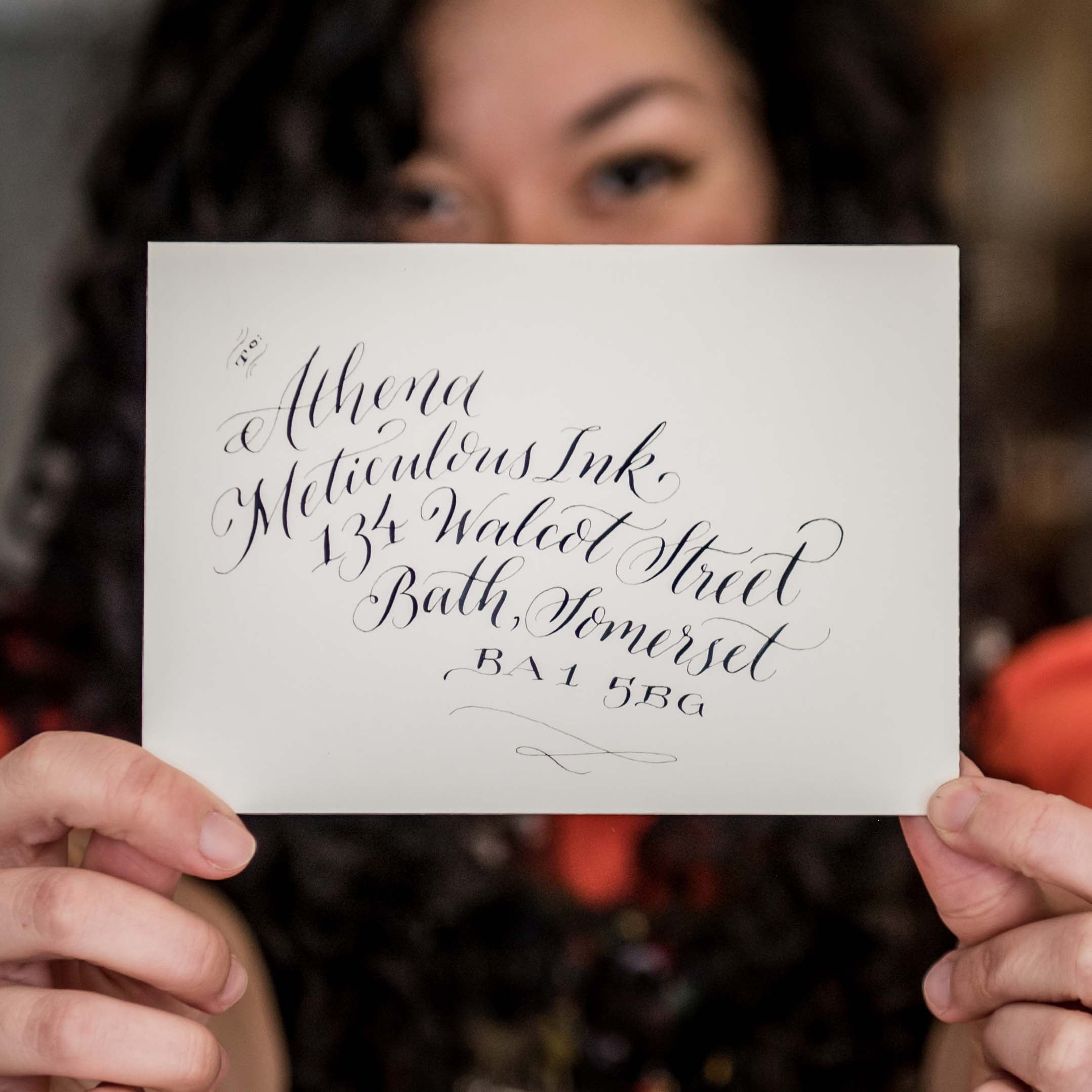
Copperplate Calligraphy
Copperplate is where we at Meticulous Ink are truly at home. During the Italian Renaissance (1400-1500 CE), Classical texts were rediscovered, which meant styles like uncial had a resurgence. The name ‘copperplate’ derives from the press plate made of copper that would be etched in order for a piece of text to be re-created identically on a machine, rather than by-hand. A pointed nib, rather than a broad one, was used and the letters became angled and narrower, giving the Copperplate Style. Copperplate Calligraphy brought a flow to calligraphy, letters are joined and contrasting lines are created by pressure from the hand.

Literacy rates were increasing and texts were being more widely distributed, thanks to the invention of the printing press in the 15th century. A piece of text no longer required multiple scribes and hours of work; printing became cheaper and the written word became more accessible. Calligraphy was an art still held by those with high status and, due to the time and skill it takes, Copperplate Calligraphy evokes a special occasion, which is why it is perfect for occasions like weddings.
Brush Lettering
Chinese Calligraphy has been practised in the East for over 2000 years, using a pointed brush and black ink. Nowadays brush pens, already filled with ink, are a popular way to get into hand-lettering as the tools you need are ready to use. They offer a more informal looking style and pens like the Tombow’s dual tip are great if you don’t want to get messy with ink. The flexible nib of the brush pen can be tricky to get used to, as with copperplate calligraphy it requires a delicate hand in order to create contrasting strokes, but the script looks more informal as it uses similar shapes to modern handwriting.
Modern Calligraphy
There has been an explosion in ‘modern calligraphy’ over the last decade. I can think of a dozen brands, from fashion to stationery, that use modern calligraphic text to add playfulness. The style of modern calligraphy is very relaxed, rather than formal, it is similar to copperplate in terms of long ascenders and descenders and flourishes, but the x-height, descenders and ascenders are varied, rather than consistent. There is still a rhythm and balance in the letters, but it is less identifiable than in a script like Gothic. You can use a sharp nib, like the Nikko G nib, or a brush pen, like the Fudenosuke Hard Tip brush pen. As the style reflects a more ‘hand-written’ feel it adds a personal touch.

Calligraphy and typography have developed over the centuries with the introduction of new materials and tools from the chisel to the brush pen. Despite the introduction of the printing press in Western Europe in the 15th Century, hand-written calligraphy hasn’t been superseded. Calligraphy and letterpress can work in harmony, with letterpress taking on the bulk of the text and calligraphy adding that extra flourish. That’s why, at Meticulous Ink, we are keeping both traditions alive, using modern letterpress plates, on our 1960s Heidelberg printing presses, and traditional iron gall ink in our Copperplate Calligraphy Workshops, marrying both old and new.